UPDATE! The winner is Tom Horstmann! Thanks to everyone for playing. This was a very close one.
—-
Voting is now open for the latest poorly-defined contest! Which fan-made choking poster should Stu use at Hinterlands Bar? (Vote in the poll at the bottom of the page, below all the entries.)
(1.) First off, this D&D inspired lunacy from Tony Ochre
(2.) The Peaches themselves get in on the action, with this model from Scott Hillman.

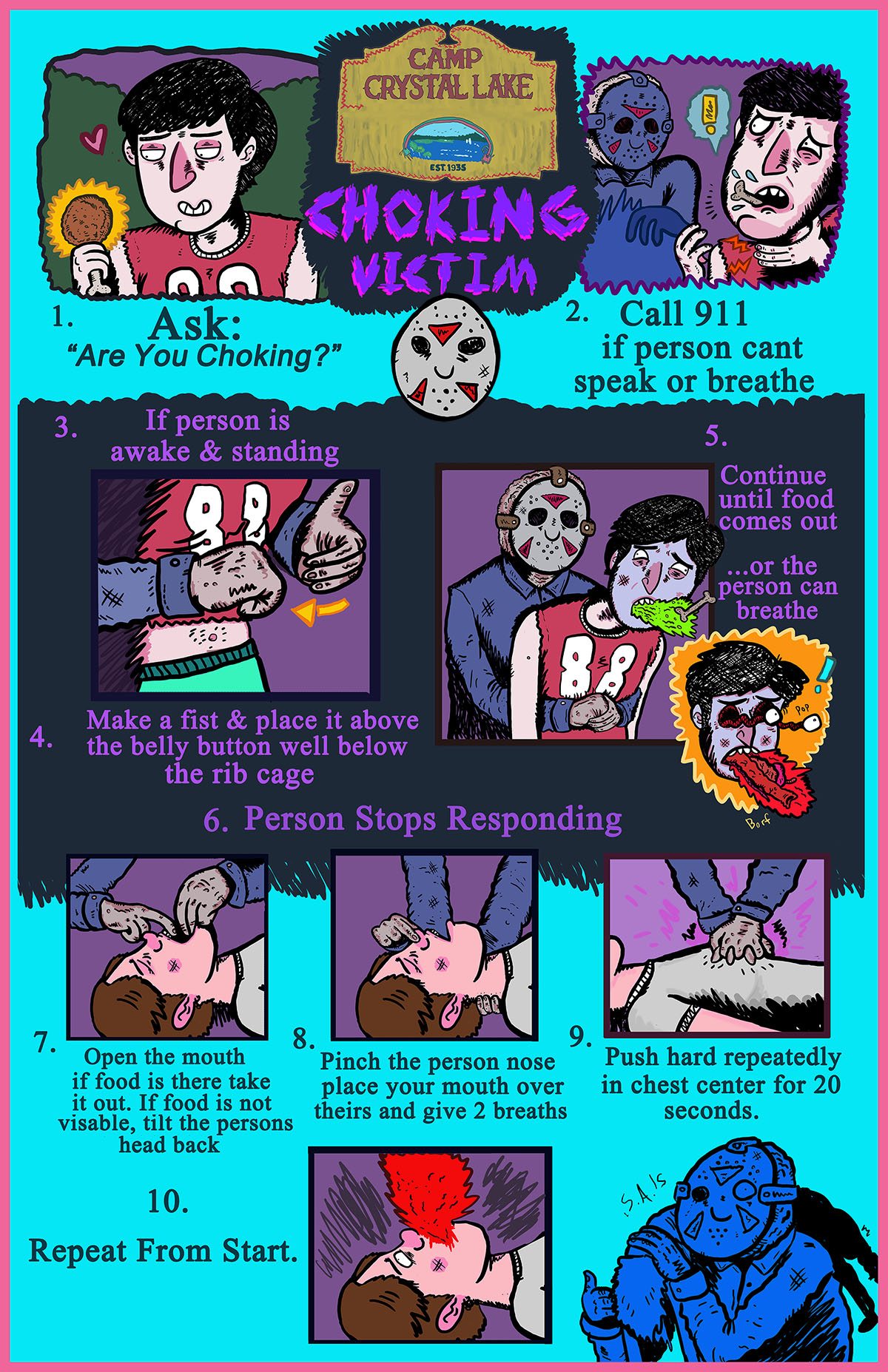
(3.) Sam Arshawsky brings us safety advice from Camp Crystal Lake.

(4.) The classic Monster Manual gets a makeover from Sean Wilkins.

(5.) The legendary “Cho King” graces Tom Horstmann’s poster.

(6.) Jasmine Gires gives us a cornucopia of helpful monsters.

(7.) Lovely line art from Kyle Anthony.

(8.) Larry Zhuo Zhang goes with a medieval theme.

(9.) Who better to teach us about choking than Mr. Submarine Sandwich himself, the Invisible Maniac, in this poster from Stephen Train?


Oh man all of these are SO AWESOME, I almost feel bad picking one over the others…
Sweet
Coolest monsters!
As much as I love the Invisible Maniac one, I gotta give it to Tony Ochre Jelly.
It is easy to understand , clear . I think #5 is the best out of 9 poster .
Is the poll this comment field? If so, I vote for #1.
Tom hortamanns is by far the best looking and easiest to read.
I vote #1 .
Hahahahaha it’s pretty great! but I feel like Cho King reminds me more of old timey horror, and goes better with the name Hinterlands. That said, wonderful job EVERYONE. They’re all so good!
I don’t know, that piece by sam is pretty great…
Two D&D posters? I love this group. But isn’t that the OG Players Handbook, not the Monster Manual?
My Boyfriend is Tom Horstmann, creator of the Cho King. He says he refuses to solicit votes on social media. Too which I say, you never told ME I couldn’t solicit votes. C’mon guys? Help an art kid get some visibility out here. He loves the podcast.
Jess NO! guys just vote for your favorites even if it’s not mine. a
I didn’t tell people to pick you I just think you spend a whole lot of time and patience on it AND it’s the only original piece, apart from the hilarious D and D in number 1. I wanted to show the guys how much you put into this contest. HOURS.
These are awesome. Horstmann’s still my favorite (I’m dating him so it has to be. Also I genuinely like it) but I love the first one too. Still hope Tom wins, because he’s trying to be an artist for a living and this would be nice exposure. That being said, I have already resigned myself to the fact that we are probably going to be poor forever, and Tony’s poster is really funny. At least he will have lost to a really good one.
No5, is my favorite
Good job~
Cool!
Put down one for the Cho King.
5 Tomhorstmann’s I like the color
I vote #5, Thomas horstmann’s post was simple and clear in text, and uses 5 figures of real person drawings in 4 key steps in treatments, very precise and powerful presentations.
If you choose one that’s in ALL CAPS I suggest changing it into sentence case so that it can be read faster.